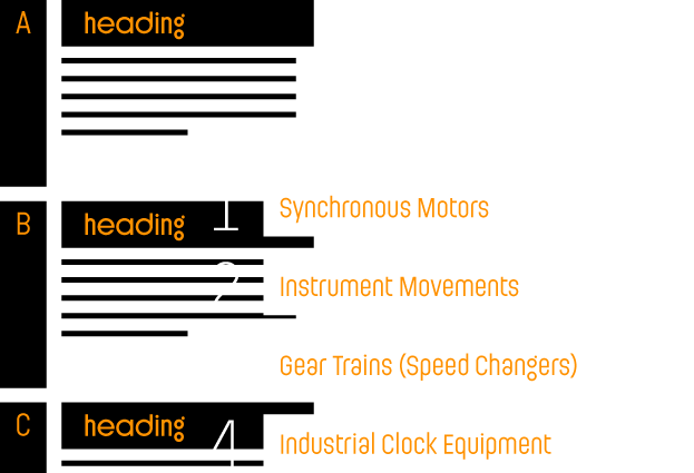
Ladislav Sutnar was one of the most significant and also most universal pioneers of modern graphic and information design. It was therefore only a matter of time before he added font creation into his area of expertise. This took place in 1958, when he drew a part of the alphabet and a set of numerals to be used in marking houses in Bronx in New York. He would later develop a similar concept for the information system of the local Brooklyn School. It’s not surprising that Sutnar’s fonts have all the characteristics typical of his work: simplicity, lucidity, directness and a strong graphical impact.

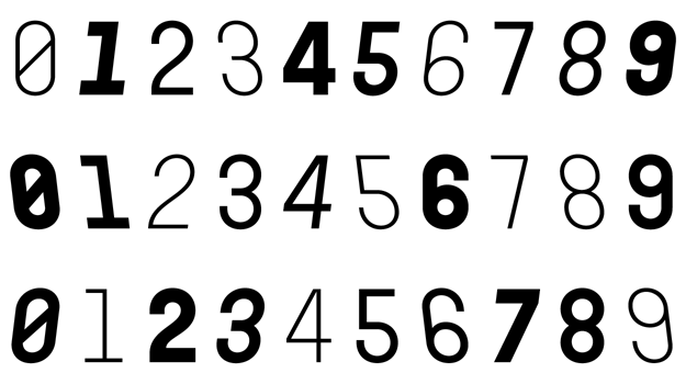
The Ladislav font revitalises Sutnar’s legacy, while not explicitly copying any of his original fonts. It however keeps true to their technicist character and initial principles of character creation - a simple modular system of combined geometrical segments. This approach affects all round shapes of capital and lowercase letters, as well as the shapes of the majority of numbers.
Basic uppercase forms are derived from pencil and ink drawings for the Brooklyn School navigation system. Most characters’ proportions are altered however, as the optical effect is given preference over strict and limiting adherence to geometry. During the course of the work, several construction changes of some of the details have taken place, such as in the connections of the diagonals of the uppercase M, N, R and the number 4, while some of the characters were completely redrawn (for example Q, S, 2). The whole character set therefore has a much more balanced appearance as well as increased legibility.


The key to the shape of lowercase letters is found in the sign on the residential house at 645 Castle Hill Ave., represented by the distinctive shape composition characteristic of the letter a. The lowercase letters seamlessly tie in with the character of the uppercase letters: primarily their simple frame, stripped of all superfluous details. By far the most distinctive character of the type family is the atypical lowercase g, created by two unconnected circles and dot-shaped ear. Other characters are executed delicately, in a civil fashion.
The Ladislav type family consists of font styles, derived from four basic weights (Light to Bold). Apart from traditional italics, Ladislav also contains atypical, left-inclining italics. These weren’t simply slanted left, but were completely redrawn, so that they would look natural and would work in harmony with the other styles in all weights.


Apart from the default uppercase and lowercase letters, we’ve also created a number of stylistic alternates to bring variety and allow rythm changes to typesetting. The first stylistic set replaces compressed rounded characters with variants derived from circles, serif brackets in joints to rounded shapes can be enabled and several shape alternatives of characters can be used. The set of diacritics is traditionally extensive enough to support the majority of languages using the Latin alphabet.
The font contains both proportional and monospaced numbers in the basic character set. These maintain a constant character width in all styles and allow easy vertical alignment.

The Inline uppercase style supplements the Ladislav font family with a powerful decorative element, which further expands the font’s potential. Non-standard ligatures, together with stylistic variants of several characters, provide a completely new rhythm to each headline.
This additional style is available for free until the end of June. All you need to do is register at www.suitcasetype.com, and you’ll be able to download the print version of the font, as well as generate the required webfont for your site.

Ladislav Sutnar (1897—1976) devoted his whole life to comprehensible visual communication in public spaces and in everyday life. First in Czechoslovakia and from 1939 onwards also in New York, where he joined numerous other influential emigrants, such as El Lisickij, Herbert Bayer or László Moholy-Nagy. Sutnar progressively worked on graphic design of books and magazines, advertising graphics, product catalogues, visual styles and orientation systems, but he also designed wooden toys, engaged himself in scenography, drinking glassware and porcelain creation. A significant segment of his activity was also exhibition design and, naturally, free range painting. His insights into design and visual flow are noted in several specialist publications (Controlled Visual Flow, Visual Design in Action), which rank as one of the most important works about graphic design to have been published. Selected texts by Ladislav Sutnar are also available in the recently published book Sutnar in texts (Mental Vitamins).
